grouped_buttons
A set of Flutter widgets that makes grouping Checkboxes and Radio Buttons much easier!

Installing
Add the following to your pubspec.yaml file:
dependencies:
  grouped_buttons: ^1.0.4
Simple Usage
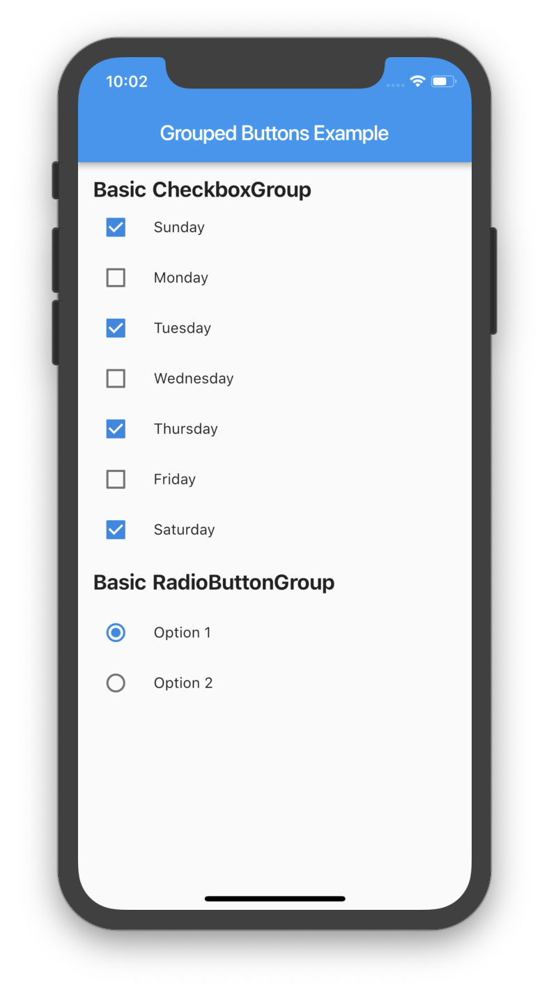
Creating a basic CheckboxGroup
CheckboxGroup(
  labels: <String>[
    "Sunday",
    "Monday",
    "Tuesday",
    "Wednesday",
    "Thursday",
    "Friday",
    "Saturday",
    "Sunday",
  ],
  onSelected: (List<String> checked) => print(checked.toString())
);
Creating a basic RadioButtonGroup
RadioButtonGroup(
  labels: <String>[
    "Option 1",
    "Option 2",
  ],
  onSelected: (String selected) => print(selected)
);
Screenshot
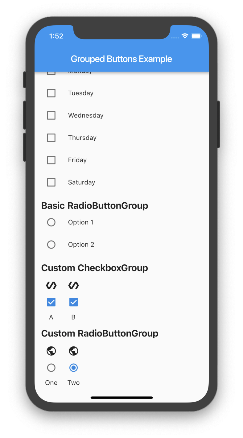
Custom Usage
There are several options that allow for more control.
Custom CheckboxGroup
| Properties | Description |
|---|---|
activeColor | The color to use when a Checkbox is checked. |
checkColor | The color to use for the check icon when a Checkbox is checked. |
checked | Specifies which boxes to be automatically checked. Every element must match a label. This is useful for clearing all selections (set it to []). If this is non-null, then the user must handle updating this list; otherwise, the state of the CheckboxGroup won’t change. |
disabled | Specifies which boxes should be disabled. If this is non-null, no boxes will be disabled. The strings passed to this must match the labels. |
itemBuilder | Called when needed to build a CheckboxGroup element. |
labels | (required) A list of strings that describes each Checkbox. Each label must be distinct. |
labelStyle | The style to use for the labels. |
margin | Empty space surrounding the CheckboxGroup. |
onChange | Called when the value of the CheckboxGroup changes. |
onSelected | Called when the user makes a selection. |
orientation | Specifies the orientation to display elements. Either GroupedButtonsOrientation.HORIZONTAL or GroupedButtonsOrientation.VERTICAL. |
padding | Empty space in which to inset the CheckboxGroup. |
tristate | If true the checkbox’s value can be true, false, or null. |
List<String> _checked = ["A", "B"];

CheckboxGroup(
  orientation: GroupedButtonsOrientation.HORIZONTAL,
  margin: const EdgeInsets.only(left: 12.0),
  onSelected: (List selected) => setState((){
    _checked = selected;
  }),
  labels: <String>[
    "A",
    "B",
  ],
  checked: _checked,
  itemBuilder: (Checkbox cb, Text txt, int i){
    return Column(
      children: <Widget>[
        Icon(Icons.polymer),
        cb,
        txt,
      ],
    );
  },
);
Custom RadioButtonGroup
| Properties | Description |
|---|---|
activeColor | The color to use when a Radio button is checked. |
disabled | Specifies which buttons should be disabled. If this is non-null, no buttons will be disabled. The strings passed to this must match the labels. |
itemBuilder | Called when needed to build a RadioButtonGroup element. |
labels | (required) A list of strings that describes each Radio button. Each label must be distinct. |
labelStyle | The style to use for the labels. |
margin | Empty space surrounding the RadioButtonGroup. |
onChange | Called when the value of the RadioButtonGroup changes. |
onSelected | Called when the user makes a selection. |
orientation | Specifies the orientation to display elements. Either GroupedButtonsOrientation.HORIZONTAL or GroupedButtonsOrientation.VERTICAL. |
padding | Empty space in which to inset the RadioButtonGroup. |
picked | Specifies which Radio button to automatically pick. Every element must match a label. This is useful for clearing what is picked (set it to “”). If this is non-null, then the user must handle updating this; otherwise, the state of the RadioButtonGroup won’t change. |
String _picked = "Two";

RadioButtonGroup(
  orientation: GroupedButtonsOrientation.HORIZONTAL,
  margin: const EdgeInsets.only(left: 12.0),
  onSelected: (String selected) => setState((){
    _picked = selected;
  }),
  labels: <String>[
    "One",
    "Two",
  ],
  picked: _picked,
  itemBuilder: (Radio rb, Text txt, int i){
    return Column(
      children: <Widget>[
        Icon(Icons.public),
        rb,
        txt,
      ],
    );
  },
);
Screenshot
Download Source Code on GitHub
Provides the list of the opensource Flutter apps collection with GitHub repository.
