IntervalProgressBar
An interval progress widget for Flutter.

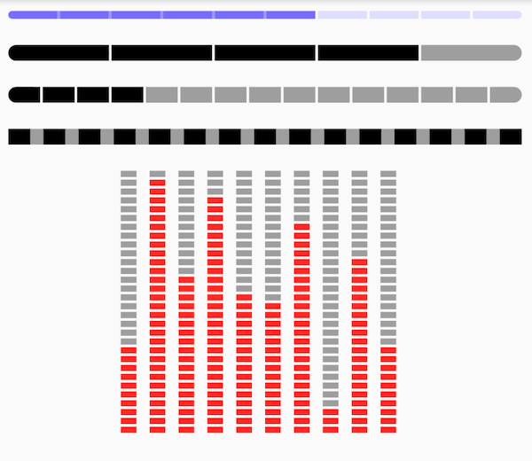
Preview
Depend on it
https://pub.dev/packages/intervalprogressbar
Add this to your package’s pubspec.yaml file:
dependencies:
  intervalprogressbar: ^{last_version}
Features
- Horizontal
- Vertical
- Interval Progress
- Colorful
Getting Started
Preview Sample Code
Center(
   child: Row(
       mainAxisAlignment: MainAxisAlignment.center,
       children: [10, 29, 18, 27, 16, 15, 24, 3, 20, 10].map<Widget>((i) {
         return Padding(
             padding: EdgeInsets.only(right: 10),
             child: IntervalProgressBar(
                 direction: IntervalProgressDirection.vertical,
                 max: 30,
                 progress: i,
                 intervalSize: 2,
                 size: Size(12, 200),
                 highlightColor: Colors.red,
                 defaultColor: Colors.grey,
                 intervalColor: Colors.transparent,
                 intervalHighlightColor: Colors.transparent,
                 reverse: true,
                 radius: 0));
       }).toList()),
)
Property
| Property | type | note |
|---|---|---|
| direction | enum | ProgressBar’s direction, support vertical and horizontal |
| max | int | count of default blocks |
| progress | int | count of highlight blocks |
| intervalSize | int | size of interval blocks. when vertical direction, means height, when horizontal direction, means width |
| size | Size | size of this widget |
| highlightColor | Color | color of highlight blocks |
| defaultColor | Color | color of default blocks |
| intervalColor | Color | color of default intervals |
| intervalHighlightColor | Color | color of intervals which between highlight blocks |
| reverse | bool | |
| radius | int |
Download interval progress bar Source Code on GitHub
Provides the list of the opensource Flutter apps collection with GitHub repository.
