flutter_calendar_carousel
Calendar widget for flutter that is swipeable horizontally. This widget can help you build your own calendar widget highly customizable. Now you can even add your icon for each event.

New Feature
- Check out great feature
customDayBuilderwork done by maxgmer .
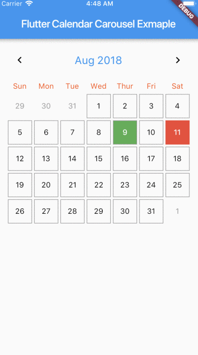
Rectangular style
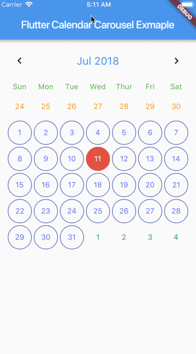
Circular style
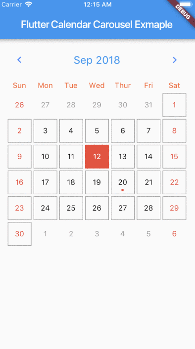
No border

Marked Dates
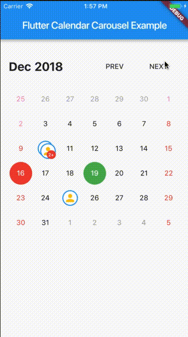
Custom Icon Events
Getting Started
For help getting started with Flutter, view our online documentation.
Props
| props | types | defaultValues |
|---|---|---|
| viewPortFraction | double | 1.0 |
| prevDaysTextStyle | TextStyle | |
| daysTextStyle | TextStyle | |
| nextDaysTextStyle | TextStyle | |
| prevMonthDayBorderColor | Color | Colors.transparent |
| thisMonthDayBorderColor | Color | Colors.transparent |
| nextMonthDayBorderColor | Color | Colors.transparent |
| dayPadding | double | 2.0 |
| height | double | double.infinity |
| width | double | double.infinity |
| todayTextStyle | TextStyle | fontSize: 14.0, color: Colors.white |
| dayButtonColor | Color | Colors.red |
| todayBorderColor | Color | Colors.red |
| todayButtonColor | Colors | Colors.red |
| selectedDateTime | DateTime | |
| selectedDayTextStyle | TextStyle | fontSize: 14.0, color: Colors.white |
| selectedDayBorderColor | Color | Colors.green |
| selectedDayButtonColor | Color | Colors.green |
| daysHaveCircularBorder | bool | |
| onDayPressed | Func | |
| weekdayTextStyle | TextStyle | fontSize: 14.0, color: Colors.deepOrange |
| iconColor | Color | Colors.blueAccent |
| headerTextStyle | TextStyle | fontSize: 20.0, color: Colors.blue |
| headerText | Text | Text('${DateFormat.yMMM().format(this._dates[1])}') |
| weekendTextStyle | TextStyle | fontSize: 14.0, color: Colors.pinkAccent |
| markedDatesMap | Events | null |
| markedDateWidget | Color | Positioned(child: Container(color: Colors.blueAccent, height: 4.0, width: 4.0), bottom: 4.0, left: 18.0); |
| markedDateShowIcon | bool | false |
| markedDateIconBorderColor | Color | |
| markedDateIconMaxShown | int | 2 |
| markedDateIconMargin | double | 5.0 |
| markedDateIconBuilder | MarkedDateIconBuilder<T> | |
| markedDateIconOffset | double | 5.0 |
| markedDateCustomShapeBorder | ShapeBorder | null |
| markedDateCustomTextStyle | TextStyle | null |
| markedDateMoreCustomDecoration | Decoration | |
| markedDateMoreCustomTextStyle | TextStyle | |
| headerMargin | EdgetInsets | const EdgeInsets.symmetric(vertical: 16.0) |
| headerTitleTouchable | bool | false |
| onHeaderTitlePressed | Function | () => _selectDateFromPicker() |
| showHeader | bool | |
| showHeaderButton | bool | |
| childAspectRatio | double | 1.0 |
| weekDayMargin | EdgeInsets | const EdgeInsets.only(bottom: 4.0) |
| weekFormat | bool | false |
| locale | String | en |
| firstDayOfWeek | int | null |
| onCalendarChanged | Function(DateTime) | |
| minSelectedDate | DateTime | |
| maxSelectedDate | DateTime | |
| inactiveDaysTextStyle | TextStyle | |
| inactiveWeekendTextStyle | TextStyle | |
| weekDayFormat | WeekdayFormat | short |
| staticSixWeekFormat | bool | false |
| showOnlyCurrentMonthDate | bool | false |
| dayCrossAxisAlignment | CrossAxisAlignment | CrossAxisAlignment.center |
| dayMainAxisAlignment | MainAxisAlignment | CrossAlignment.center |
| showIconBehindDayText | bool | false |
| pageScrollPhysics | ScrollPhysics | ScrollPhysics |
With CalendarCarousel<YourEventClass> and EventList<YourEventClass> you can specifiy a custom Event class.
Install
Add flutter_calendar_carousel as a dependency in pubspec.yaml For help on adding as a dependency, view the documentation.
Usage
import 'package:flutter_calendar_carousel/flutter_calendar_carousel.dart' show CalendarCarousel;
Widget widget() {
  return Container(
    margin: EdgeInsets.symmetric(horizontal: 16.0),
    child: CalendarCarousel<Event>(
      onDayPressed: (DateTime date, List<Event> events) {
        this.setState(() => _currentDate = date);
      },
      weekendTextStyle: TextStyle(
        color: Colors.red,
      ),
      thisMonthDayBorderColor: Colors.grey,
//      weekDays: null, /// for pass null when you do not want to render weekDays
//      headerText: Container( /// Example for rendering custom header
//        child: Text('Custom Header'),
//      ),
      customDayBuilder: (   /// you can provide your own build function to make custom day containers
        bool isSelectable,
        int index,
        bool isSelectedDay,
        bool isToday,
        bool isPrevMonthDay,
        TextStyle textStyle,
        bool isNextMonthDay,
        bool isThisMonthDay,
        DateTime day,
      ) {
          /// If you return null, [CalendarCarousel] will build container for current [day] with default function.
          /// This way you can build custom containers for specific days only, leaving rest as default.

          // Example: every 15th of month, we have a flight, we can place an icon in the container like that:
          if (day.day == 15) {
            return Center(
              child: Icon(Icons.local_airport),
            );
          } else {
            return null;
          }
      },
      weekFormat: false,
      markedDatesMap: _markedDateMap,
      height: 420.0,
      selectedDateTime: _currentDate,
      daysHaveCircularBorder: false, /// null for not rendering any border, true for circular border, false for rectangular border
    ),
  );
}
TODO
- Render weekdays.
- Customizable headerWidget.
- Set weekdays visibility.
- Customizable textStyles for days in weekend.
- Marked Dates.
- Multiple Marked Dates.
- Customizable weekend days.
- Week Calendar.
- Carousel Week Calendar.
- Multiple days selections.
- Widget test.
Download Calendar widget source code on GitHub
Provides the list of the opensource Flutter apps collection with GitHub repository.
