flutter_text_drawable
A flutter package that gives you the flexibility to create and customize text user avatars like Gmail and Contacts. It also provides a TextDrawableListTile widget which wraps around the material ListTile widget to provide easy control when using TextDrawable with a ListTile.

Basic Usage
Simply add the TextDrawable to your widget tree like so:
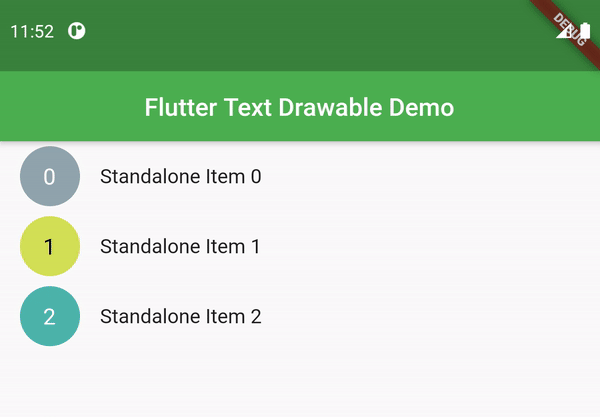
TextDrawable(
  text: "Some Text",
)
Respond to Tap Events (Like Gmail)
TextDrawable widget has an option to receive tap events and switch between the text being displayed and a checked icon.
Just set isTappable = true.
If you wish to receive a callback when the widget is tapped, pass in a function which accepts a bool to the onTapproperty.
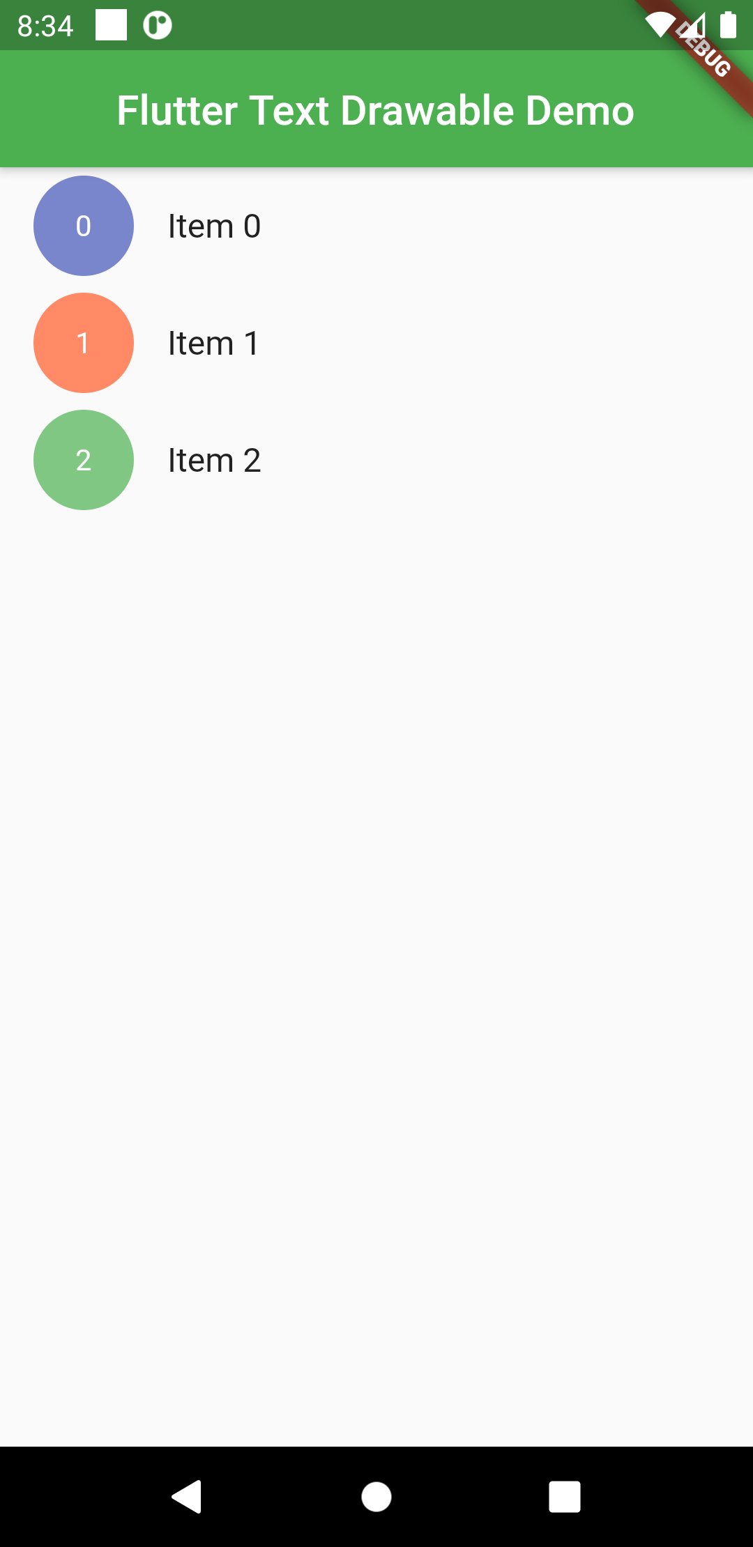
TextDrawable(
  text: "$index",
  isTappable: true,
  onTap: (val) {
    print("$index selected: $val");
  },
  boxShape: BoxShape.rectangle,
  borderRadius: BorderRadius.circular(8),
),
TextDrawableListTile usage
The TextDrawableListTile requires to parameters for a minimal usage – drawableText (String) and title(Widget). It supports all the params of the material ListTile widgets. The leading TextDrawable text animates into a check icon when tile is longPressed.
When selected = true, long press events will not have any effect.
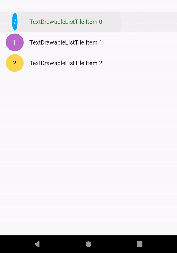
Can be used like so:
ListView.builder(
  itemCount: 3,
  itemBuilder: (context, index) {
    return TextDrawableListTile(
      drawableText: "$index",
      title: Text("$index"),
    );
  },
)
TextDrawable Properties available
| Property | Type | Description |
|---|---|---|
text | String | The text you wish to display. Only first character will be displayed. |
height | double | Height of the TextDrawable widget. |
width | double | Width of the TextDrawable widget. Defaults to 48. |
backgroundColor | Color | Background color to for the widget. If not specified, a random color will be generated. |
textStyle | TextStyle | TextStyle for the text to be displayed. Default fontSize is 18. color is determined based on contrast with the backgroundColor. |
boxShape | BoxShape | Shape of the widget. Defaults to BoxShape.circle. |
borderRadius | BorderRadiusGeometry | Border radius of the widget. Only specify this if boxShape == BoxShape.rectangle. |
duration | Duration | Specify duration of animation between text and checked icon. Defaults to current theme animation duration. |
isTappable | bool | Set to true when you want the widget to recognize taps. Typical selection behaviour found in the Gmail app. |
onTap | Function(bool) | Callback received when widget is tapped. It emits its current selected status. |
Example
Check the examples tab or take a look at the example file.
Download Flutter text drawable widget source code on GitHub
Provides the list of the opensource Flutter apps collection with GitHub repository.
