About: This package provides a responsive modal with multiple pages, motion animation for page transitions, and scrollable content within each page.

WoltModalSheet
WoltModalSheet is designed to revolutionize the use of Flutter modal sheets. Built with Wolt-grade design quality and used extensively in Wolt products, this UI component offers a visually appealing and user-friendly modal sheet with multiple pages, motion animation for page transitions, and scrollable content within each page.
Features
Multi-Page Layout
Traverse through numerous pages within a single sheet.
Scrollable Content
Greater flexibility with scrollable content per page, accommodating large content effortlessly.
Responsive Design
The modal sheet adjusts to fit all screen sizes, appearing as a dialog on larger screens and as a bottom sheet on smaller screens, guided by user-specified conditions.
Motion Animation
Engage users with dynamic motion animation for page transitions and scrolling.
| Pagination | Scrolling |
|---|---|
 |
 |
Imperative and Declarative Navigation
The library showcases examples of both imperative and declarative navigation patterns to display modal sheet on screen.
Dynamic Pagination
User input can dynamically shape the modal sheet’s page list.
State Management Integration
Pages in the Wolt Modal Sheet offer a customizable look and the page components are provided with an instance of WoltModalSheetPage class. The API provides a way to manage the state among the page components to be used with popular libraries such as Bloc and Provider
Understanding the page elements
Each element within the WoltModalSheet has a role to play, offering context, navigational assistance, and explicit action prompts to the user. By understanding these elements and their roles, you can fully harness the power of WoltModalSheet and create an intuitive and engaging user experience.
The structure is organized across layers on the z-axis:
- Main Content Layer: The fundamental content of the page, including the optional page title, optional hero image, and the main content, which may be scrollable.
- Top Bar Layer: Further above the main content layer, this layer with the filled color includes the top bar title and may become hidden or sticky based on scroll position and specific properties.
- Navigation Bar Layer: Sitting at the top of the top bar layer on z-axis, this transparent-background layer contains navigational widgets for the interface, such as back or close buttons.
- Sticky Action Bar Layer: Positioned at the top of the z axis, this layer guides the user towards the next step, uses an optional gentle gradient on top to hint that there is more content below ready for scrolling.

By employing these various layers, you can create an interactive and visually appealing interface that resonates with users. Each layer contributes to the overall coherence of the page, serving a specific purpose and enhancing the overall user experience.

Navigation bar widgets
The navigation bar has a transparent background, and resides at the top of the sheet, situated directly above the top bar on the z-axis. It includes two specific widgets: the leading and the trailing. The leading widget usually functions as the back button, enabling users to navigate to the previous page. The trailing widget often serves as the close button, utilized to close the modal sheet. Together, these widgets provide clear and intuitive navigational control, differentiating themselves from the top bar by focusing specifically on directional navigation within the interface.
Top bar and top bar title
The Top Bar sits above the main content layer and below the navigation bar layer. It aids users in grasping the context by displaying an optional title. In scenarios where sheets are filled with content requiring scrolling, the top bar becomes visible as the user scrolls, causing the page title replaced. At this point, the top bar adopts a ‘sticky’ position at the top, guaranteeing consistent visibility. Its design is flexible, with an option to remain hidden or always visible regardless of the scroll position. The navigation bar widgets overlay above the top bar, and the top bar title is symmetrically framed between the leading and trailing navigation bar widgets.
The Top Bar design is flexible, when hasTopBarLayer is set to false, the top bar and the topBarTitle will be hidden. If isTopBarLayerAlwaysVisible set to true, the top bar will be always visible regardless of the scroll position.
Sticky action bar (SAB)
The Sticky Action Bar (SAB) guides the user towards the next step. Anchored to the bottom of the view, the SAB elevates above the content with an optional gentle gradient. This position guarantees that the action remains visible, subtly hinting to the user that there is more content to be explored below the fold by scrolling.
Hero image
An optional Hero Image can be positioned at the top of the main content. This element immediately grabs the user’s attention, effectively conveying the primary theme or message of the content.
Page Title
An optional page title above the main content provides users with a quick understanding of what to expect from the page. As the user scrolls, this title becomes hidden, at which point the top bar title continues to serve this context-providing purpose.
Main content
The main content delivers information according to the user need. It can be scrollable to handle larger content. The content is built lazily to improve the performance.
Here is an example that shows all the modal sheet elements in use:

Getting started
To use this plugin, add wolt_modal_sheet as a dependency in your pubspec.yaml file.
Usage
This package has 4 example projects.
Example app
The example app demonstrates how to display a two-page modal sheet.
class MainApp extends StatelessWidget {
const MainApp({super.key});
@override
Widget build(BuildContext context) {
final pageIndexNotifier = ValueNotifier(0);
WoltModalSheetPage page1(BuildContext modalSheetContext) {
return WoltModalSheetPage.withSingleChild(
stickyActionBar: Padding(
padding: const EdgeInsets.all(16.0),
child: Column(
children: [
ElevatedButton(
onPressed: () => Navigator.of(modalSheetContext).pop(),
child: const SizedBox(
height: 56.0,
width: double.infinity,
child: Center(child: Text('Cancel')),
),
),
const SizedBox(height: 8),
ElevatedButton(
onPressed: () => pageIndexNotifier.value = pageIndexNotifier.value + 1,
child: const SizedBox(
height: 56.0,
width: double.infinity,
child: Center(child: Text('Next page')),
),
),
],
),
),
topBarTitle: Text('Pagination', style: Theme.of(context).textTheme.titleSmall),
isTopBarLayerAlwaysVisible: true,
trailingNavBarWidget: IconButton(
padding: const EdgeInsets.all(16),
icon: const Icon(Icons.close),
onPressed: Navigator.of(modalSheetContext).pop,
),
child: const Padding(
padding: EdgeInsets.fromLTRB(16, 16, 16, 150),
child: Text(
'''
Pagination involves a sequence of screens the user navigates sequentially. We chose a lateral motion for these transitions. When proceeding forward, the next screen emerges from the right; moving backward, the screen reverts to its original position. We felt that sliding the next screen entirely from the right could be overly distracting. As a result, we decided to move and fade in the next page using 30% of the modal side.
''',
)),
);
}
WoltModalSheetPage page2(BuildContext modalSheetContext) {
return WoltModalSheetPage.withCustomSliverList(
stickyActionBar: Padding(
padding: const EdgeInsets.fromLTRB(16, 0, 16, 16),
child: ElevatedButton(
onPressed: () {
Navigator.of(modalSheetContext).pop();
pageIndexNotifier.value = 0;
},
child: const SizedBox(
height: 56.0,
width: double.infinity,
child: Center(child: Text('Close')),
),
),
),
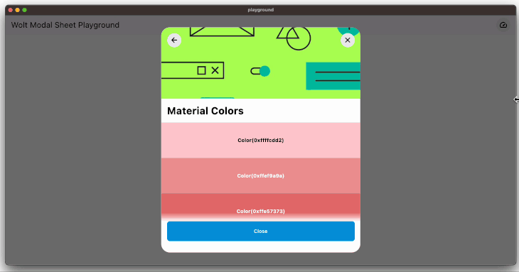
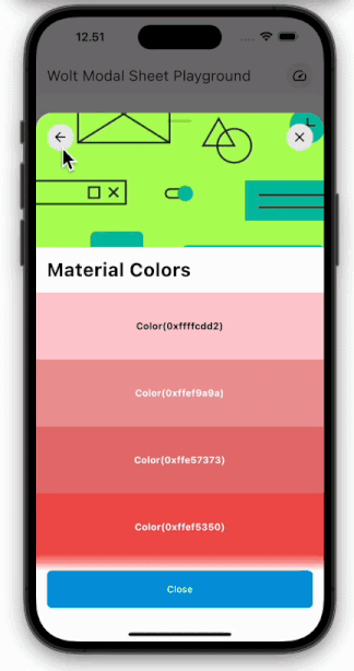
pageTitle: Padding(
padding: const EdgeInsets.symmetric(horizontal: 16),
child: Text(
'Material Colors',
style:
Theme.of(context).textTheme.headlineMedium!.copyWith(fontWeight: FontWeight.bold),
),
),
heroImageHeight: 200,
heroImage: const Image(
image: AssetImage('lib/assets/images/material_colors_hero.png'),
fit: BoxFit.cover,
),
leadingNavBarWidget: IconButton(
padding: const EdgeInsets.all(16),
icon: const Icon(Icons.arrow_back_rounded),
onPressed: () => pageIndexNotifier.value = pageIndexNotifier.value - 1,
),
trailingNavBarWidget: IconButton(
padding: const EdgeInsets.all(16),
icon: const Icon(Icons.close),
onPressed: () {
Navigator.of(modalSheetContext).pop();
pageIndexNotifier.value = 0;
},
),
sliverList: SliverList(
delegate: SliverChildBuilderDelegate(
(_, index) => ColorTile(color: allMaterialColors[index]),
childCount: allMaterialColors.length,
),
),
);
}
return MaterialApp(
theme: ThemeData(colorSchemeSeed: const Color(0xFF009DE0), useMaterial3: true),
home: Scaffold(
body: Builder(
builder: (context) {
return Center(
child: SizedBox(
width: 200,
child: ElevatedButton(
onPressed: () {
WoltModalSheet.show<void>(
pageIndexNotifier: pageIndexNotifier,
context: context,
pageListBuilder: (modalSheetContext) {
return [
page1(modalSheetContext),
page2(modalSheetContext),
];
},
modalTypeBuilder: (context) {
final size = MediaQuery.of(context).size.width;
if (size < 768) {
return WoltModalType.bottomSheet;
} else {
return WoltModalType.dialog;
}
},
onModalDismissedWithBarrierTap: () {
debugPrint('Closed modal sheet with barrier tap');
Navigator.of(context).pop();
pageIndexNotifier.value = 0;
},
maxDialogWidth: 560,
minDialogWidth: 400,
minPageHeight: 0.4,
maxPageHeight: 0.9,
);
},
child: const SizedBox(
height: 56.0,
child: Center(child: Text('Show Modal Sheet')),
),
),
),
);
},
),
),
);
}
}
The code snippet above produces the following:

Playground app with imperative navigation
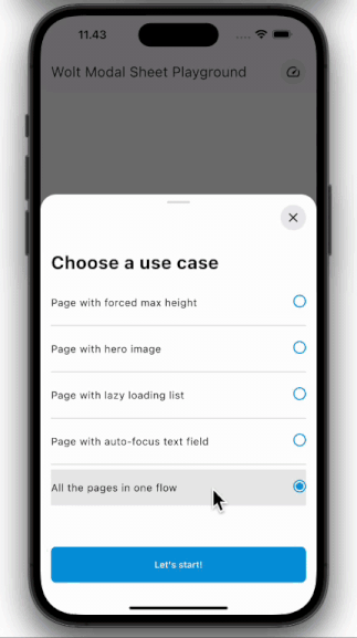
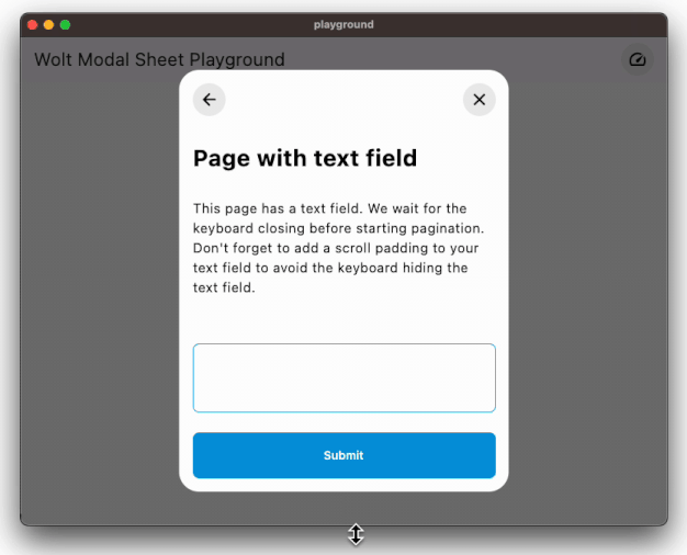
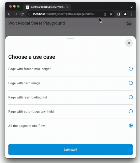
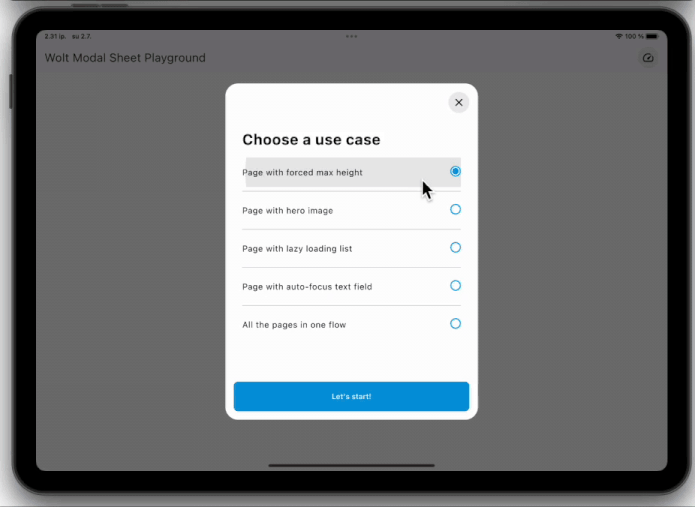
The playground app demonstrates how to imperatively show the modal sheet. The purpose of this module is to play and experiment with various use cases. These use cases include:
- A page with forced max height independent of its content.
- A page with a hero image
- A page with a list whose items are lazily built.
- A page with an auto-focused text field.
- A page without a page title nor a top bar.
Playground app with declarative navigation
The playground_navigator2 has the same content with the playground app but the modal sheet is shown using Navigator 2.0 (Router API) in a declarative way.
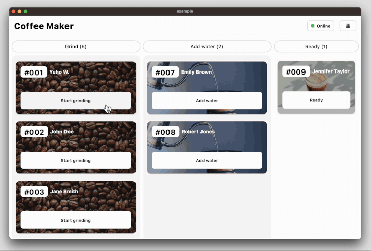
Coffee maker app for state management example
Finally, the coffee_maker app demonstrates how to manage the state among the page components with an opinionated use of the Provider state management library.
The code snippet demonstrates how to decorate the modal sheet with a change notifier provider so that the page components can be rebuilt according to the current state:
  void _onCoffeeOrderSelectedInAddWaterState(BuildContext context,
    String coffeeOrderId) {
  final model = context.read<StoreOnlineViewModel>();
  final pageIndexNotifier = ValueNotifier(0);

  WoltModalSheet.show(
    pageIndexNotifier: pageIndexNotifier,
    context: context,
    decorator: (child) {
      return ChangeNotifierProvider<StoreOnlineViewModel>.value(
        value: model,
        builder: (_, __) => child,
      );
    },
    pageListBuilderNotifier: AddWaterModalPageBuilder.build(
      coffeeOrderId: coffeeOrderId,
      goToPreviousPage: () =>
      pageIndexNotifier.value = pageIndexNotifier.value - 1,
      goToNextPage: () => pageIndexNotifier.value = pageIndexNotifier.value + 1,
    ),
    modalTypeBuilder: _modalTypeBuilder,
  );
}
Additional information
- Design Philosophy: Dive into the creative thought process behind WoltModalSheet’s functionality in our blog post . Explore how we tackled the design challenges to create an intuitive and responsive experience.
- Insights from FlutterCon’23 talk: We delved into both the design and developmental facets of this package at the FlutterCon’23 conference. Catch the enlightening recording of his talk to understand the nuances.
Download source code on GitHub
Provides the list of the opensource Flutter apps collection with GitHub repository.
