
fradio
A radio component suitable for almost any radio scenario.

Supports excellent interactive special effects, as well as a simple multi-interactive state view switching construction like eating a hamburger . You will fall in love with TA .️
Author:Newton(coorchice.cb@alibaba-inc.com)
English | 简体中文
Like it? Please cast your Star !
Features
- Wonderful interactive animation
- Support precise control of rounded corners
- Wonderful gradient effect support
- Simple but effective multi-state view building support
- Unimaginable flexible configurable items
Guide
Parameters
Basic parameters
| Param | Type | Necessary | Default | desc |
|---|---|---|---|---|
| value | <T> | false | null | The value represented by [FRadio]. When [groupValue] == [value], enter the selected state. |
| groupValue | <T> | false | null | The currently selected value of the radio group. When [groupValue] == [value], enter the selected state. |
| onChanged | ValueChanged<T> | false | null | Callback when [FRadio] is selected |
| enable | bool | false | true | it’s usable or not. Unavailable [FRadio] will not be able to change the current state by clicking. Through [disableNormal] and [disableSelected], you can customize the style in the unavailable state. |
| toggleable | bool | false | false | Is it possible to uncheck it. |
| width | double | false | 27 | width |
| height | double | false | 27 | height |
| normal | Widget | false | null | Unselected state style |
| selected | Widget | false | null | Selected state style |
| disableNormal | Widget | false | null | Unavailable style when unchecked |
| disableSelected | Widget | false | null | Unavailable styles selected |
| hover | Widget | false | null | The style when the mouse enters |
| focusNode | FocusNode | false | null | focus |
| autofocus | bool | false | false | Whether to allow automatic focus |
Default constructor extension parameters
| Param | Type | Necessary | Default | desc |
|---|---|---|---|---|
| normalColor | Color | false | Color(0xffd9d9d9) | Unselected color |
| selectedColor | Color | false | Color(0xff2593fc) | Selected color |
| hasSpace | bool | false | true | Is there a gap between the inner padding and the edges? The default is true. The spacing is provided by [FRadio] the golden ratio, developers do not need to care. |
| border | double | false | null | The border is wide. By default, [FRadio] provides the golden ratio, and developers do not need to care. |
| child | Widget | false | null | The decoration components in the unselected state are at the top level. |
| selectedChild | Widget | false | null | The decorative component in the selected state is at the top level. |
| hoverChild | Widget | false | null | The decoration component when hovering the mouse is at the top level. |
| gradient | Gradient | false | null | This property allows to configure the gradient effect in the selected state, which will override [selectedColor]. |
| duration | Duration | false | Duration(milliseconds: 150) | Duration of state switching animation. |
| fill | bool | false | true | When selected, whether to allow internal filling. |
| corner | FRadioCorner | false | Circle | Corner. |
Demo
Basic Demo

FRadio(
  value: 1,
  groupValue: groupValue_1,
  onChanged: (value) {
    setState(() {
      groupValue_1 = value;
    });
  },
),

FRadio(
  value: 2,
  groupValue: groupValue_1,
  onChanged: (value) {
    setState(() {
      groupValue_1 = value;
    });
  },
)
A regular FRadio is very simple to build. You only need to configure:
value: It will indicate the current value represented by FRadio.
groupValue:Indicates the selected value of the current radio group.
onChanged:When selected, it will callback. In this callback, you need to assign the value value of FRadio to the radio groupgroupValue to complete the switch of group options.
It is worth noting that FRadio will only be selected when groupValue == value. This is very flexible, that is to say, you only need to change the groupValue to switch options at will.
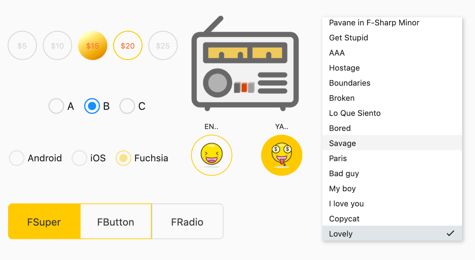
Enable & Toggleable
FRadio(
  value: 1,
  groupValue: groupValue_2,
  onChanged: (value) {
    setState(() {
      groupValue_2 = value;
    });
  },
  toggleable: true,
  enable: enable_1,
  selectedColor: Color(0xffffc900),
),
Through the enable attribute, you can control the availability of FRadio. When FRadio is not available, the unavailable style will be displayed. They of course include selected and unselected.
The unavailable styles of FRadio built by the default constructor are grayed out.
If you want to build different unavailable styles, you can configure disableNormal (unchecked unavailable styles) anddisableSelected (check unavailable styles) through the FRadio.custom () constructor.
FRadio will allow the user to cancel the selection, which can be achieved by configuring toggleable: true. Of course, by default, we do not open this feature.
Space & Corner & Border

FRadio(
  width: 100,
  height: 50,
  value: 1,
  groupValue: groupValue_3,
  onChanged: (value) {
    setState(() {
      groupValue_3 = value;
    });
  },
  selectedColor: Color(0xffffc900),
  corner: FRadioCorner(leftTopCorner: 6, leftBottomCorner: 6),
  border: 1,
  hasSpace: false,
  selectedChild:
      Text("FSuper", style: TextStyle(color: Color(0xff333333))),
  child: Text("FSuper", style: TextStyle(color: Color(0xff333333))),
)
In this chestnut , FRadio shows several abilities that are not possible for radio components.
Through the corner attribute, you can accurately control the corners so that FRadio is no longer a circle.
hasSpace gives you the freedom to choose whether you want to keep the distance between the inner padding and the edges, as it is by default.
Usually, FRadio has a set of exquisite calculation methods internally to provide a very beautiful view. By default, FRadio will automatically calculate the width of the border to maintain a harmonious aesthetic.
But you can still configure it as needed through the border attribute.
Gradient

FRadio(
  width: 50,
  height: 50,
  value: index + 1,
  groupValue: groupValue_4,
  onChanged: (value) {
    setState(() {
      groupValue_4 = value;
    });
  },
  gradient: LinearGradient(
    colors: [
      Color(0xffFEFDBB),
      Color(0xffFFE16C),
      Color(0xffEA9D1C),
      Color(0xffD46307),
    ],
    begin: Alignment(-0.1, -0.9),
    end: Alignment(1.0, 1.0),
    stops: [0.0, 0.2, 0.7, 1.0],
  ),
  selectedColor: Color(0xffffc900),
  hasSpace: false,
  border: 1.5,
  child: Text(
    "\$${5 * (index + 1)}",
    style: TextStyle(color: Color(0xffd9d9d9), fontSize: 13),
  ),
  hoverChild: Text(
    "\$${5 * (index + 1)}",
    style:
        TextStyle(color: Colors.deepOrangeAccent, fontSize: 13),
  ),
  selectedChild: Text("\$${5 * (index + 1)}",
      style: TextStyle(
          color: Colors.deepOrangeAccent, fontSize: 13)),
)
You see, this is the magical use of gradients.
gradient accepts multiple types of gradient configurations. If you plan to make the radio view look more colorful or more spatial, you can try it.
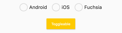
Decoration
FRadio(
  width: 80,
  height: 80,
  value: 1,
  groupValue: groupValue_5,
  onChanged: (value) {
    setState(() {
      groupValue_5 = value;
    });
  },
  child: Image.asset("assets/emoji_0.png", width: 50),
  hoverChild: Image.asset("assets/emoji_1.png", width: 50),
  selectedChild: Image.asset("assets/emoji_2.png", width: 50),
  hasSpace: false,
  toggleable: true,
  selectedColor: Color(0xffffc900),
  border: 1.5,
)
FRadio magically makes the entire radio no longer boring!
child and selectedChild configure the top-level decorative components.
How is the mouse hover effect constructed?
The border color will automatically accept the selected color configured by selectedColor when hovering. The decoration can be configured through hoverChild.
When hoverChild is not configured, the selected state decoration configured by selectedChild will be accepted.
how about it? This is so interesting!
This is customizable!

If the default constructor does not satisfy you, what else do you need?
By the way, Customize!
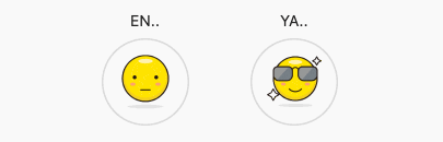
Through the FRadio.custom () constructor, you can configure the style of FRadio in different interactive states through: normal, selected, disableNormal, disableSelected, hover.
This will untie the hemp rope in your hand, you are free, and you can start to create at will.
ListView.builder(
  itemCount: list.length,
  itemBuilder: (context, index) {
    return FRadio.custom(
      value: index,
      groupValue: groupValue_7,
      onChanged: (value) {
        setState(() {
          groupValue_7 = value;
        });
      },
      normal: Container(
        width: 250,
        height: 100,
        color: Colors.white,
        padding: EdgeInsets.only(left: 12, right: 12),
        child: text(index),
      ),
      hover: Container(
        width: 250,
        height: 100,
        color: Color(0xff212121).withOpacity(0.05),
        padding: EdgeInsets.only(left: 12, right: 12),
        child: text(index),
      ),
      selected: Container(
        padding: EdgeInsets.only(left: 12, right: 12),
        color: Color(0xff607D8B).withOpacity(0.2),
        child: Row(
          crossAxisAlignment: CrossAxisAlignment.center,
          mainAxisAlignment: MainAxisAlignment.spaceBetween,
          children: [
            Text("${list[index]}"),
            Icon(
              Icons.check,
              size: 18,
            ),
          ],
        ),
      ),
    );
  },
)
Now you are free, so don’t skimp on creativity.
FRadio is not just a small round button, it can solve almost all radio problems.
How to use?
Add dependencies in the project pubspec.yaml file:
pub dependency
dependencies:
  fradio: ^<version number>
Attention,please go to [pub] (https://pub.dev/packages/fradio) to get the latest version number of FRadio
git dependencies
dependencies:
  fradio:
    git:
      url: 'git@github.com:Fliggy-Mobile/fradio.git'
      ref: ''<Branch number or tag number>'
Attention,please refer to [FRadio] (https://github.com/Fliggy-Mobile/fradio) official project for branch number or tag.
License
Copyright 2020-present Fliggy Android Team <alitrip_android@list.alibaba-inc.com>.

Licensed under the Apache License, Version 2.0 (the "License");
you may not use this file except in compliance with the License.
You may obtain a copy of the License at following link.

    http://www.apache.org/licenses/LICENSE-2.0

Unless required by applicable law or agreed to in writing, software
distributed under the License is distributed on an "AS IS" BASIS,
WITHOUT WARRANTIES OR CONDITIONS OF ANY KIND, either express or implied.
See the License for the specific language governing permissions and
limitations under the License.
Like it? Please cast your Star !
—
How to run Demo project?
- clone project to local
- Enter the project
exampledirectory and run the following command
flutter create .
- Run the demo in
example
Download fradio source code on GitHub
https://github.com/Fliggy-Mobile/fradio
Provides the list of the opensource Flutter apps collection with GitHub repository.
