
FButton
From then on, developers only need to master one Button component, which is enough.

Support rounded corners, borders, image, special effects, loading mode.
Author:Newton(coorchice.cb@alibaba-inc.com)
English | 简体中文
Like it? Please cast your Star !
Features
- Rich corner effect
- Exquisite border decoration
- Gradient effect
- Flexible icon support
- Intimate Loading mode
- Cool interaction Special effects
- More sense of space Shadow
Guide
Parameters
Basic parameters
| Param | Type | Necessary | Default | desc |
|---|---|---|---|---|
| onPressed | VoidCallback | true | null | Click callback. If null, FButton will enter an unavailable state |
| height | double | false | null | height |
| width | double | false | null | width |
| text | String | false | null | button text |
| textColor | Color | false | Colors.black12 | Button text color |
| fontSize | double | false | 12 | Button text size |
| fontStyle | FontStyle | false | null | Button text font |
| color | Color | false | null | Button color |
| disabledColor | Color | false | null | Color when FButton is unavailable |
| focusNode | FocusNode | false | null | focus |
| autofocus | bool | false | false | Whether it can automatically obtain focus |
| padding | EdgeInsetsGeometry | false | EdgeInsets.symmetric(horizontal: 16.0, vertical: 16) | FButton internal spacing |
| corner | Corner | false | null | Configure corners of FButton |
| cornerStyle | CornerStyle | false | CornerStyle.round | Configure the corner style of FButton. round-rounded corners, bevel-beveled |
| strokeColor | Color | false | Colors.black | Border color |
| strokeWidth | double | false | 0 | Border width. The border will appear when strokeWidth > 0 |
| gradient | Gradient | false | null | Configure gradient colors. Will override the color |
| fontHeight | double | false | null | height of one line of text = textSize * fontHeight |
| textWeight | double | false | FontWeight.normal | Text weight |
Effect parameters
| Param | Type | Necessary | Default | desc |
|---|---|---|---|---|
| effect | bool | false | false | Whether to enable touch effects |
| clickEffect | bool | false | false | Whether to enable click effects |
| hoverColor | Color | false | null | FButton color when hovering |
| highlightColor | Color | false | null | The color of the FButton when touched. effect:true required |
| splashColor | Color | false | null | The color of the position of the contact when touched. effect:truerequired |
Shadow parameters
| Param | Type | Necessary | Default | desc |
|---|---|---|---|---|
| shadowColor | Color | false | Colors.grey | Shadow color |
| shadowOffset | Offset | false | Offset.zero | Shadow offset |
| shadowBlur | double | false | 1.0 | Shadow blur degree, the larger the value, the larger the shadow range |
Icon & Loading parameters
| Param | Type | Necessary | Default | desc |
|---|---|---|---|---|
| image | Widget | false | null | An icon can be configured for FButton |
| imageMargin | double | false | 6.0 | Spacing between icon and text |
| imageAlignment | ImageAlignment | false | ImageAlignment.left | Relative position of icon and text |
| loading | bool | false | false | Whether to enter the Loading state |
| clickLoading | bool | false | false | Whether to enter Loading state after clicking FButton |
| loadingColor | Color | false | null | Loading colors |
| loadingStrokeWidth | double | false | 4.0 | Loading width |
| hideTextOnLoading | bool | false | false | Whether to hide text in the loading state |
| loadingText | String | false | null | Loading text |
| loadingSize | double | false | 12 | Loading size |
Demo
Basic Demo

// #Normal
FButton(
  width: 100,
  text: "#Normal",
  textColor: Colors.white,
  fontSize: 9,
  color: Color(0xffFFc900),
  onPressed: () {
    toast(context, "FWidget ????");
  },
)

// #Disable
FButton(
  width: 100,
  text: "#Disable",
  textColor: Colors.white,
  fontSize: 9,
  color: Color(0xffFFc900),
  disabledTextColor: Colors.b
  disabledColor: Colors.grey[
)
By simply configuring text and onPressed, you can construct an available FButton.
If onPressed is not set, FButton will be automatically recognized as not unavailable. At this time, ** FButton ** will have a default unavailable status style.
You can also freely configure the style of FButton when it is not available via the disabledXXX attribute.
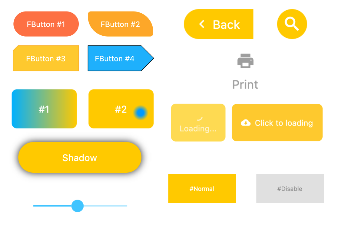
Corner & Stroke
// #1
FButton(
  width: 130,
  effect: true,
  text: "FButton #1",
  textColor: Colors.white,
  color: Color(0xffFF7043),
  onPressed: () {},
  clickEffect: true,
  corner: FButtonCorner.all(25),
),

// #2
FButton(
  width: 130,
  effect: true,
  text: "FButton #2",
  textColor: Colors.white,
  color: Color(0xffFFA726),
  onPressed: () {},
  clickEffect: true,
  corner: FButtonCorner(
    leftBottomCorner: 40,
    leftTopCorner: 6,
    rightTopCorner: 40,
    rightBottomCorner: 6,
  ),
),

// #3
FButton(
  width: 130,
  effect: true,
  text: "FButton #3",
  textColor: Colors.white,
  color: Color(0xffFFc900),
  onPressed: () {},
  clickEffect: true,
  corner: FButtonCorner(leftTopCorner: 10),
  cornerStyle: FButtonCornerStyle.bevel,
  strokeWidth: 0.5,
  strokeColor: Color(0xffF9A825),
),

// #4
FButton(
  width: 130,
  effect: true,
  padding: EdgeInsets.fromLTRB(6, 16, 30, 16),
  text: "FButton #4",
  textColor: Colors.white,
  color: Color(0xff00B0FF),
  onPressed: () {},
  clickEffect: true,
  corner: FButtonCorner(
      rightTopCorner: 25,
      rightBottomCorner: 25),
  cornerStyle: FButtonCornerStyle.bevel,
  strokeWidth: 0.5,
  strokeColor: Color(0xff000000),
),
You can add rounded corners to FButton via the corner property. You can even control each fillet individually。
By default, the corners of FButton are rounded. By setting cornerStyle: FButtonCornerStyle.bevel, you can get a bevel effect.
FButton supports control borders, provided that strokeWidth> 0 can get the effect .
Gradient

// #1
FButton(
  width: 100,
  height: 60,
  text: "#1",
  textColor: Colors.white,
  color: Color(0xffFFc900),
  gradient: LinearGradient(colors: [
    Color(0xff00B0FF),
    Color(0xffFFc900),
  ]),
  onPressed: () {},
  clickEffect: true,
  corner: FButtonCorner.all(8),
)
Through the gradient attribute, you can build FButton with gradient colors. You can freely build many types of gradient colors.
Icon

// #1
FButton(
  width: 88,
  height: 38,
  padding: EdgeInsets.all(0),
  text: "Back",
  textColor: Colors.white,
  color: Color(0xffffc900),
  onPressed: () {
    toast(context, "Back!");
  },
  clickEffect: true,
  corner:
  FButtonCorner(
    leftTopCorner: 25,
    leftBottomCorner: 25,),
  image: Icon(
    Icons.arrow_back_ios,
    color: Colors.white,
    size: 12,
  ),
  imageMargin: 8,
),


// #3
FButton(
  onPressed: () {},
  image: Icon(
    Icons.print,
    color: Colors.grey,
  ),
  imageMargin: 8,
  imageAlignment: ImageAlignment.top,
  text: "Print",
  textColor: Colors.grey,
  color: Colors.transparent,
),
The image property can set an image for FButton and you can adjust the position of the image relative to the text, throughimageAlignment.
If the button does not need a background, just set color: Colors.transparent.
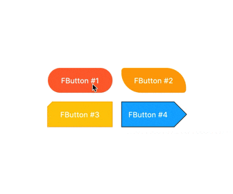
Effect
FButton(
  width: 200,
  effect: true,
  text: "Try Me!",
  textColor: Colors.white,
  color: Color(0xffffc900),
  onPressed: () {},
  clickEffect: true,
  corner: FButtonCorner.all(9),
  splashColor: Color(0xffff7043),
  highlightColor: Color(0xffE65100).withOpacity(0.20),
  hoverColor: Colors.redAccent.withOpacity(0.16),
),
By default, FButton will turn off the click effect. You can enable it by setting effect: true.
It is best not to set the
effectandclickEffectattributes to true.
At the same time, the splash color of the contact position can be configured through the splashColor attribute.
The highlight color of FButton can be configured through the highlightColor property。
hoverColor can configure the color when the mouse moves to the range of FButton, which will be used during Web development.
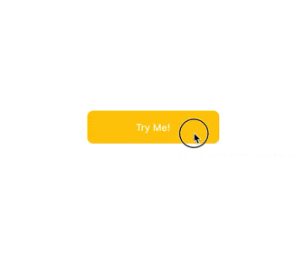
Loading
// #1
FButton(
  effect: true,
  text: "Click top loading",
  textColor: Colors.white,
  color: Color(0xffffc900),
  onPressed: () {
    print("Loading...");
  },
  clickEffect: true,
  corner: FButtonCorner.all(9),
  loadingSize: 15,
  imageMargin: 6,
  loadingStrokeWidth: 2,
  clickLoading: true,
  loadingColor: Colors.white,
  loadingText: "Loading...",
  imageAlignment: ImageAlignment.top,
),

// #2
FButton(
  width: 170,
  height: 70,
  effect: true,
  text: "Click to loading",
  textColor: Colors.white,
  color: Color(0xffffc900),
  onPressed: () {
    print("Loading...");
  },
  clickEffect: true,
  corner: FButtonCorner.all(9),
  image: Icon(
    Icons.cloud_download,
    size: 18,
    color: Colors.white,
  ),
  imageMargin: 8,
  loadingSize: 15,
  loadingStrokeWidth: 2,
  clickLoading: true,
  loadingColor: Colors.white,
  loadingText: "Loading...",
  hideTextOnLoading: true,
),
Through the loading attribute, you can configure Loading effects for ** FButton **.
When FButton is in Loading state, FButton will enter an unavailable state, onPress will no longer be triggered, and unavailable styles will also be applied.
At the same time loadingText will overwrite text if it is not null.
The click start Loading effect can be achieved through the clickLoading attribute.
The position of loading will be affected by the imageAlignment attribute.
When hideTextOnLoading: true, if FButton is in loading state, its text will be hidden.
Shadow
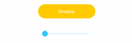
FButton(
  width: 200,
  effect: true,
  text: "Shadow",
  textColor: Colors.white,
  color: Color(0xffffc900),
  onPressed: () {},
  clickEffect: true,
  corner: FButtonCorner.all(28),
  shadowColor: Colors.black87,
  shadowBlur: _shadowBlur,
),
FButton allows you to configure the color, size, and position of the shadow.
How to use?
Add dependencies in the project pubspec.yaml file:
pub dependency
dependencies:
  fbutton: ^<version number>
Attention,please go to [pub] (https://pub.dev/packages/fbutton) to get the latest version number of FButton
git dependencies
dependencies:
  fbutton:
    git:
      url: 'git@github.com:Fliggy-Mobile/fbutton.git'
      ref: '<Branch number or tag number>'
Attention,please refer to [FButton] (https://github.com/Fliggy-Mobile/fbutton) official project for branch number or tag.
License
Copyright 2020-present Fliggy Android Team <alitrip_android@list.alibaba-inc.com>.

Licensed under the Apache License, Version 2.0 (the "License");
you may not use this file except in compliance with the License.
You may obtain a copy of the License at following link.

    http://www.apache.org/licenses/LICENSE-2.0

Unless required by applicable law or agreed to in writing, software
distributed under the License is distributed on an "AS IS" BASIS,
WITHOUT WARRANTIES OR CONDITIONS OF ANY KIND, either express or implied.
See the License for the specific language governing permissions and
limitations under the License.
Like it? Please cast your Star !
Downlaod FButton source code on GitHub
https://github.com/Fliggy-Mobile/fbutton
Provides the list of the opensource Flutter apps collection with GitHub repository.
