
Syncfusion Flutter Date Range Picker
The Syncfusion Flutter Date Range Picker is a lightweight widget that allows users to easily select a single date, multiple dates, or a range of dates. It provides month, year, decade, and century view options to quickly navigate to the desired date. It supports minimum, maximum, and disabled dates to restrict date selection.
Disclaimer: This is a commercial package. To use this package, you need to have either a Syncfusion commercial license or the Syncfusion Community LICENSE. For more details, please check the LICENSE file.
Note: Our packages are now compatible with Flutter for Web. However, this will be in Beta until Flutter for Web becomes stable.
Table of contents
Date-range-picker features
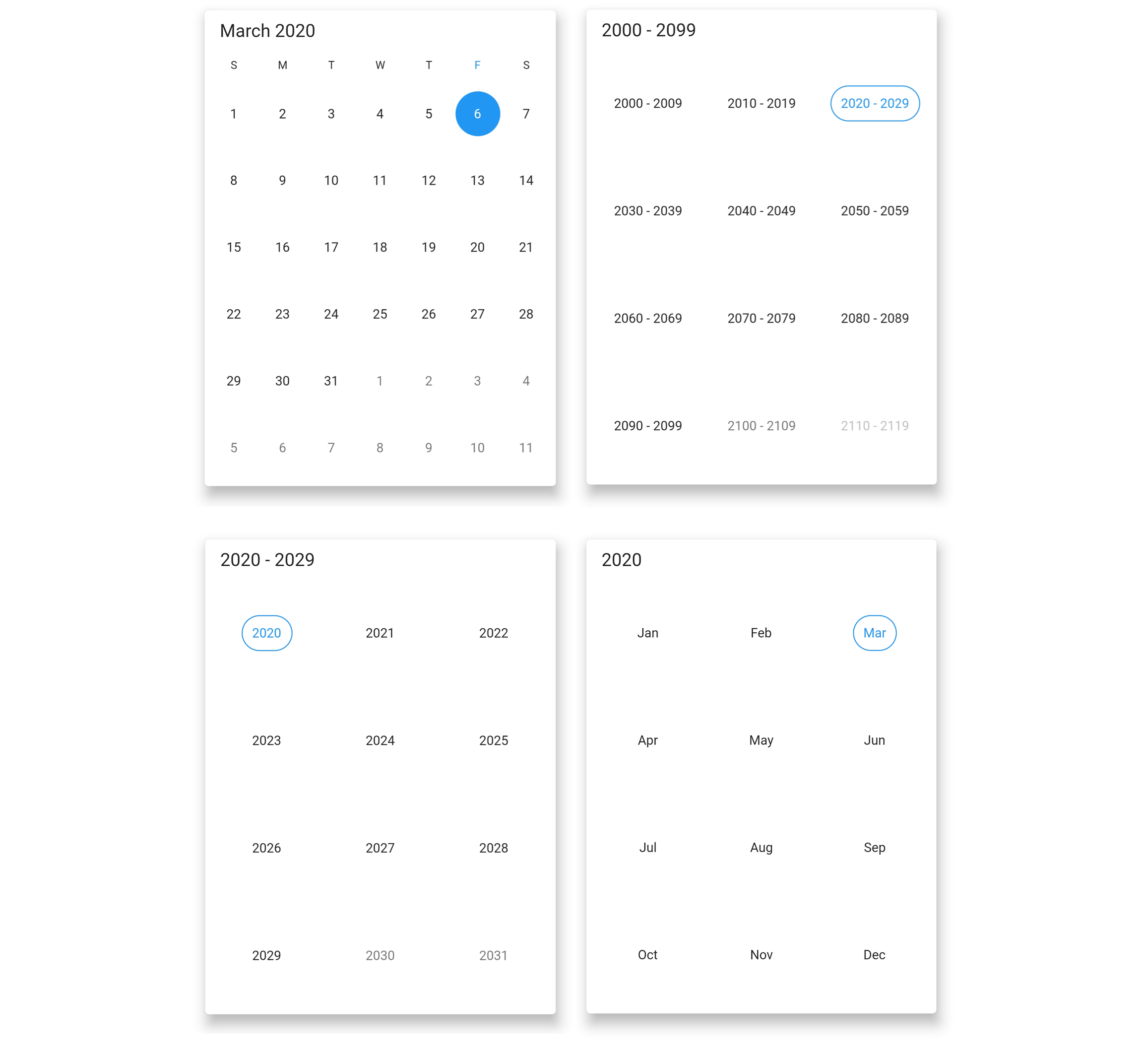
- Multiple picker views – Display month, year, decade, and century views that allow users to easily select and navigate between built-in views. Supports programmatic navigation.
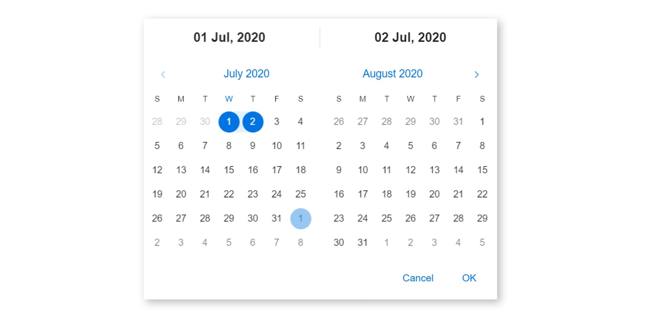
- Multi-date picker view – Display two Date Range Pickers side by side, allowing you to select ranges of dates within two separate months easily.
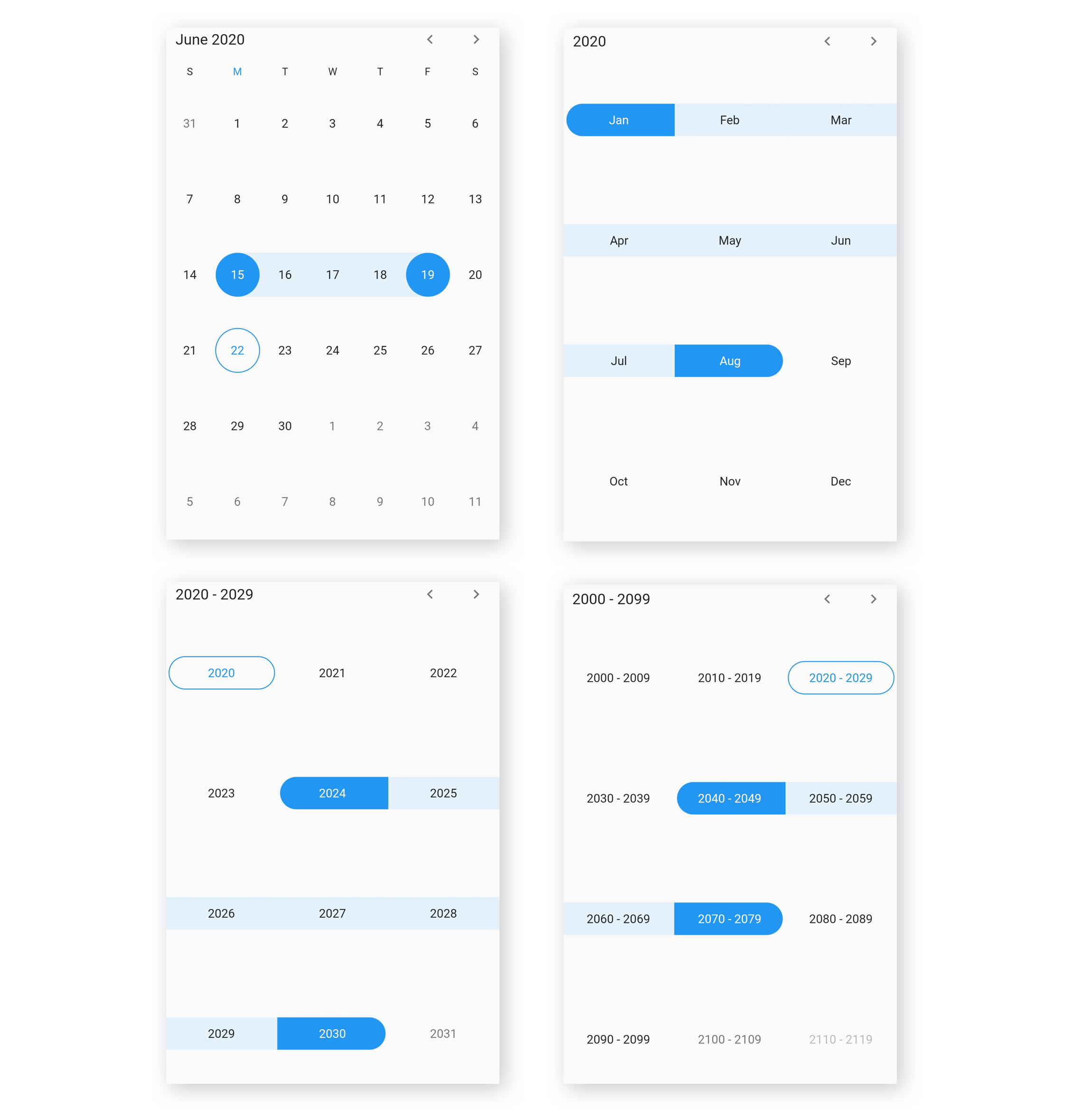
- Quick navigation – Navigate back and forth the date-range views and between different view modes.
- Enable/disable built-in view switching – Restrict users from navigating to different picker views by disabling view switching. Select values in terms of month, year, or decade with this feature enabled.
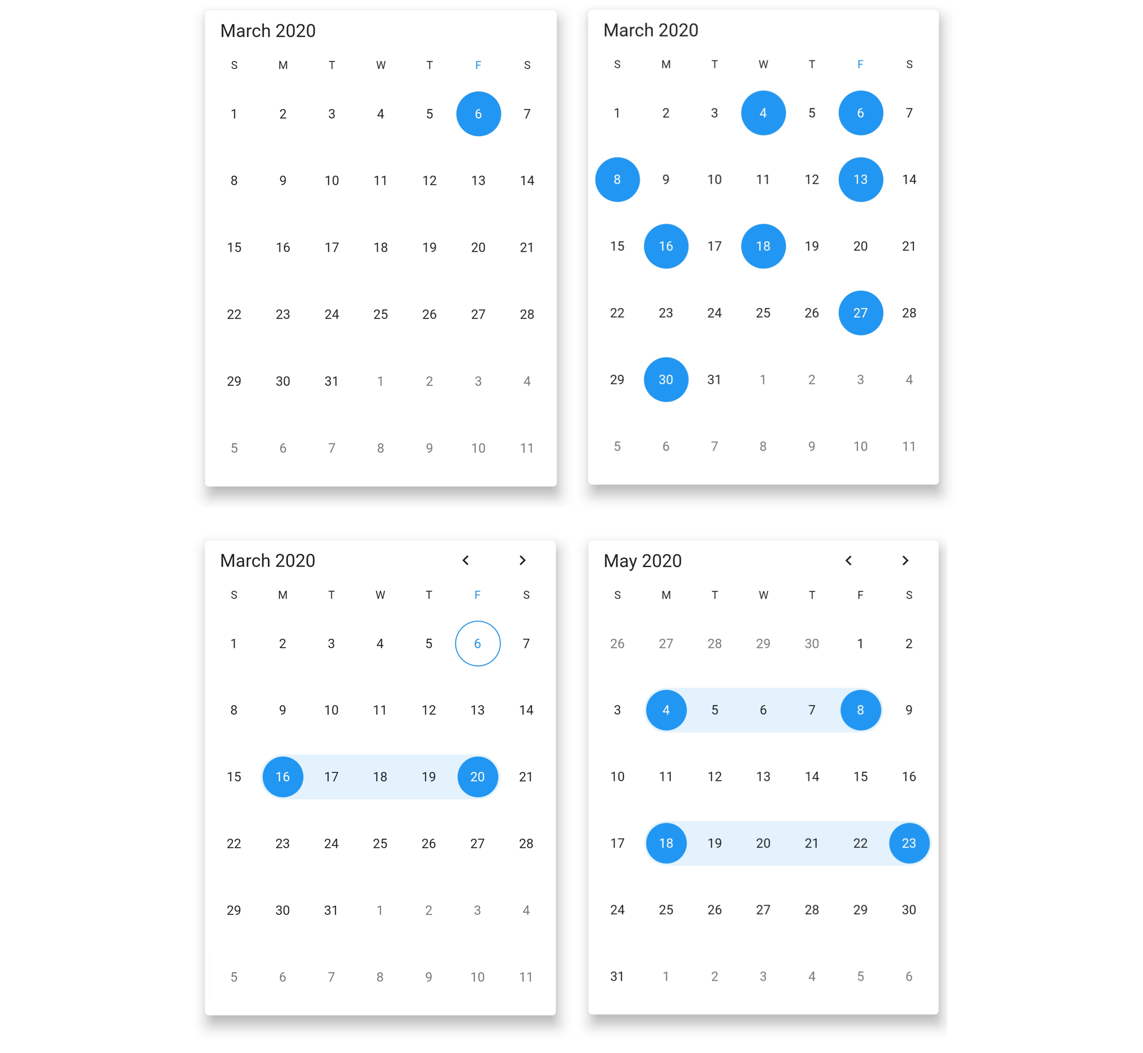
- Date selection – Select single, multiple, and range of dates. It also supports programmatic selection.
- Limit the date selection range – Select only a date range with a specific minimum and maximum numbers of days (span of days) by setting the min and max days options.
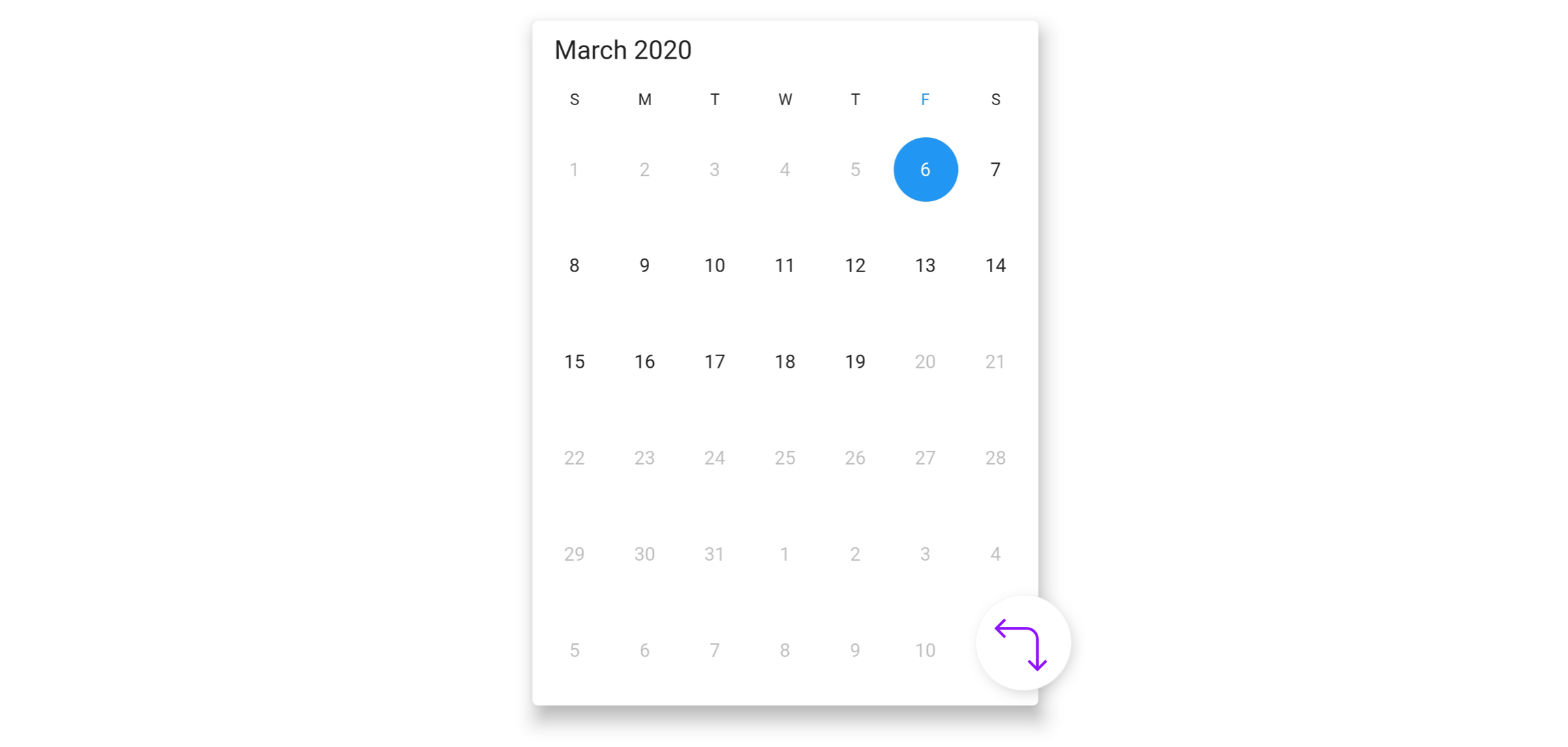
- Change first day of week – Customize the first day of the week as needed. The default first day is Sunday.
- Blackout dates – Disable any date in a calendar to make it inactive. Easily prevent the selection of weekends by disabling them.
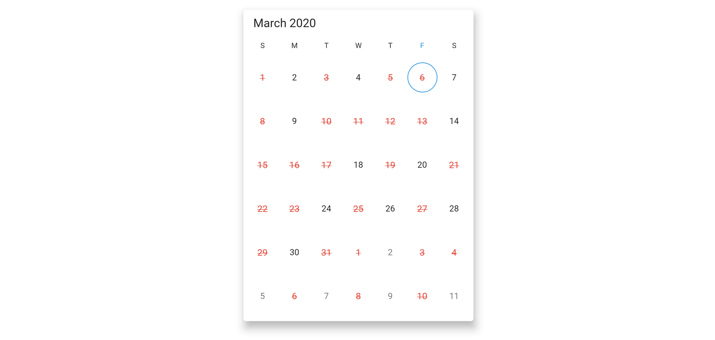
- Highlight holidays and weekends – Highlight any date or every weekend in a month as special days using decoration in Flutter date range picker.
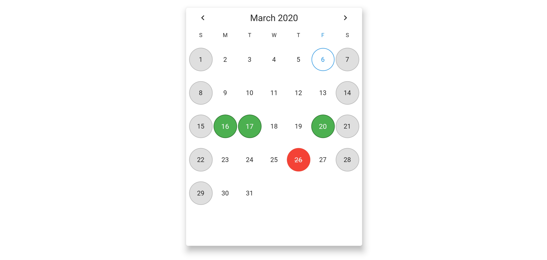
- Appearance customization – Change the look and feel of the date range picker by customizing its default appearance and style using Flutter decorations.
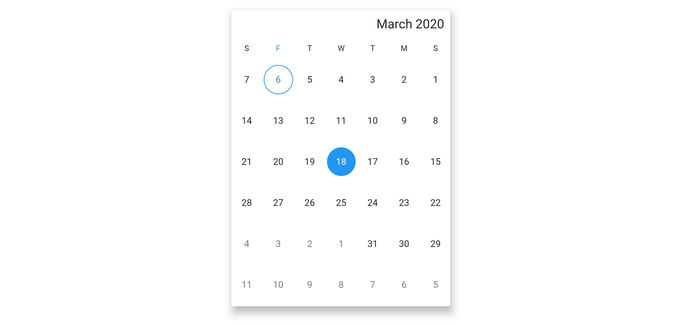
- Right to left(RTL) – Right-to-left direction support for users working in RTL languages like Hebrew and Arabic.
- Accessibility – Easy access of the date range picker by the screen readers.
- Globalization – Display the current date and time by following the globalized date and time formats.
Get the demo application
Explore the full capabilities of our Flutter widgets on your device by installing our sample browser applications from the below app stores, and view samples code in GitHub.


Other useful links
Take a look at the following to learn more about the Syncfusion Flutter DateRangePicker.
Installation
Install the latest version from pub.
Getting started
Import the following package.
import 'package:syncfusion_flutter_datepicker/datepicker.dart';
Add date range picker to the widget tree
Add the SfDateRangePicker widget as a child of any widget. Here, the SfDateRangePicker widget is added as a child of the scaffold widget.
@override
Widget build(BuildContext context) {
  return Scaffold(
      body: Container(
    child: SfDateRangePicker(),
  ));
}
Change different views
The SfDateRangePicker widget provides four different types of views to display. It can be assigned to the widget constructor by using the view property. Default view of the widget is month view. By default the current date will be displayed initially for all the date range picker views.
@override
Widget build(BuildContext context) {
  return Scaffold(
      body: SfDateRangePicker(
    view: DateRangePickerView.year,
  ));
}
Change first day of week
The DateRangePicker widget will be rendered with Sunday as the first day of the week, but you can customize it to any day by using the firstDayOfWeek property.
@override
Widget build(BuildContext context) {
	return Scaffold(
		body: SfDateRangePicker(
      view: DateRangePickerView.month,
      monthViewSettings: DateRangePickerMonthViewSettings(firstDayOfWeek: 1),
    ));
}
Date selection
The DateRangePicker supports selecting single, multiple, and range of dates. It also supports programmatic selection.
The selected date or range details can be obtained using the onSelectionChanged callback of date range picker. The callback will return the DateRangePickerSelectionChangedArgs which contains the selected date or range details.
void _onSelectionChanged(DateRangePickerSelectionChangedArgs args) {
  // TODO: implement your code here
}

@override
Widget build(BuildContext context) {
  return MaterialApp(
    home: Scaffold(
      body: Container(
        child: SfDateRangePicker(
          onSelectionChanged: _onSelectionChanged,
          selectionMode: DateRangePickerSelectionMode.range,
        ),
      ),
    ),
  );
}
Read more about Syncfusion Flutter Date Range Picker and it’s implementation on pub
https://pub.dev/packages/syncfusion_flutter_datepicker
Provides the list of the opensource Flutter apps collection with GitHub repository.

